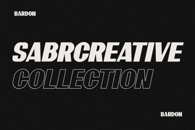
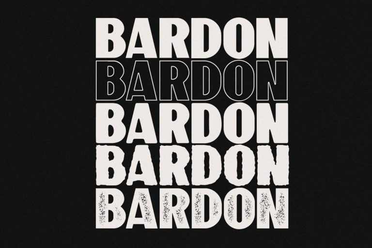
Architecture is the art of organising space with precision and purpose — and the typography that represents architectural thinking must reflect these same qualities exactly. Bardon does: a strong geometric sans serif with architectural precision built into its very structure, designed for brands where precision, authority, and forward-thinking design intelligence are non-negotiable requirements.
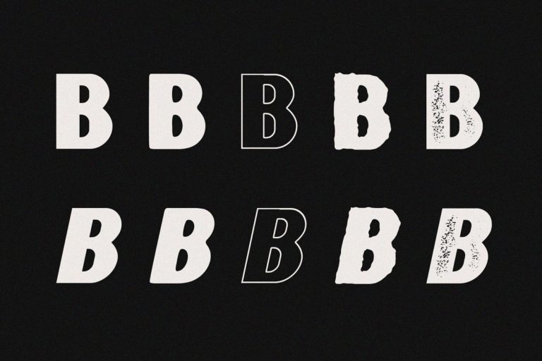
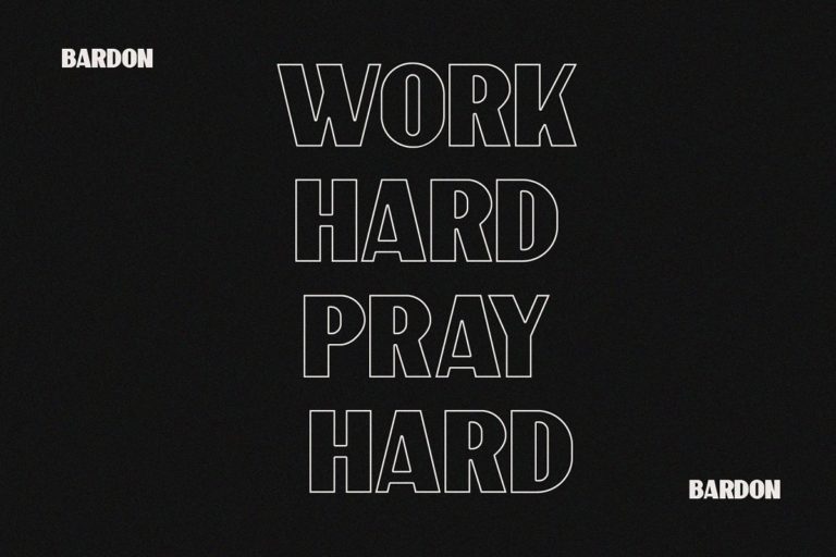
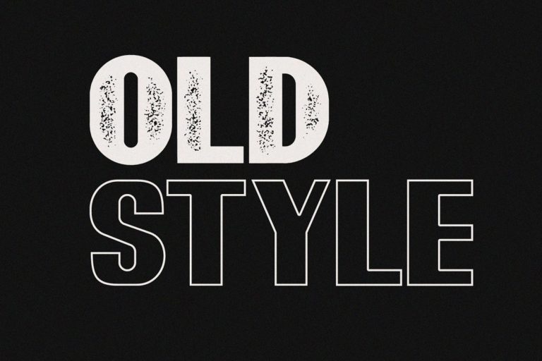
Bardon’s design is fundamentally architectural in its approach. The letterforms are constructed with the systematic discipline of engineered structures — every proportion is calculated, every stroke width is consistent, every spatial relationship between characters is optimised for visual clarity and structural integrity. The geometric foundation gives the font its authoritative presence, while carefully considered optical corrections prevent the mechanical stiffness that purely mathematical type design produces. The result is a sans serif that feels simultaneously designed and discovered — as if these proportions were always the correct ones, and Bardon’s designers simply revealed them.
Architecture firms, urban design studios, landscape architecture practices, and built environment consultancies find Bardon the natural typographic expression of their professional values — precision, intelligence, and design thinking applied with rigorous consistency. Construction brand identity for property developers, civil engineering firms, infrastructure companies, and building technology businesses uses Bardon to communicate the structural competence and project delivery capability that clients are paying premium prices to secure. Industrial design firms, product engineering companies, and manufacturing businesses with sophisticated design credentials find Bardon projects the technical authority their markets expect.
Modern tech companies with a precision engineering culture, robotics and automation brands, and deep technology startups find Bardon communicates both technical excellence and design sophistication — a combination that attracts talent, investment, and enterprise clients simultaneously.
Technical Specifications:
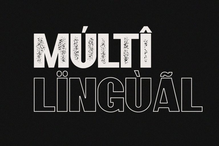
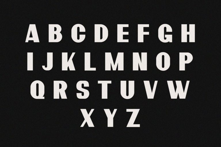
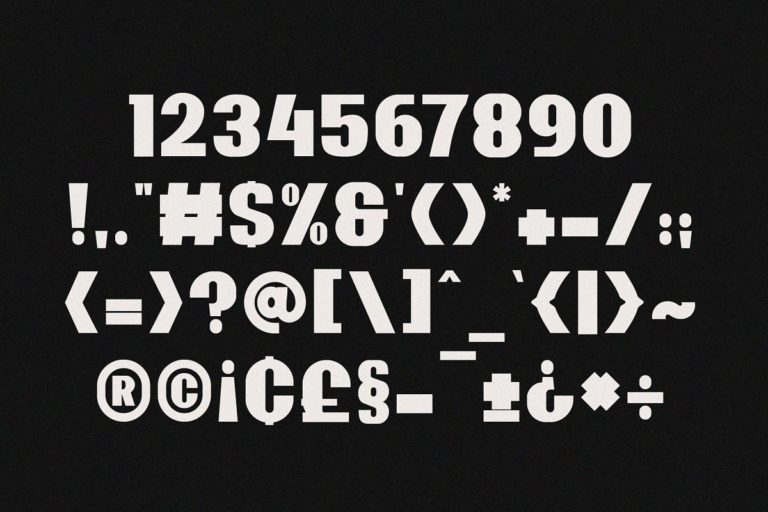
Bardon is available in OTF, TTF, and WOFF formats, compatible with Adobe Creative Suite, Figma, Sketch, Microsoft Office, and all professional design environments. The complete character set includes geometrically precise uppercase and lowercase letters, tabular and proportional numerals, punctuation, currency symbols, and multilingual Latin support. OpenType features include tabular figures for technical data presentation and kerning optimised for professional signage and print applications. WOFF format supports crisp geometric rendering for architecture firm websites, engineering company digital platforms, and tech brand web applications.
Great structures begin with great foundations. Download Bardon today and give your architecture, construction, or engineering brand the geometrically precise, architecturally authoritative typographic foundation that professional excellence demands.
Reviews
There are no reviews yet.